Transforms the axes of a ggplot into the bark scale. The data is still plotted in Hz. If you want to plot the data in Barks themselves, transform the data beforehand and plot normally. For an example of plots using this scale, see Harrington et al. (2000).
scale_x_bark(..., rev = TRUE)

scale_y_bark(..., rev = TRUE)
Arguments
| ... | Parameters passed on to |
|---|---|
| rev | Should the axis be flipped? Or rather, would you normally use
|
References
Harrington, Jonathan, Sallyanne Palethorpe, and Catherine Watson. "Monophthongal Vowel Changes in Received Pronunciation: An Acoustic Analysis of the Queen’s Christmas Broadcasts." Journal of the International Phonetic Association 30, no. 1–2 (2000): 63–78. https://doi.org/10.1017/S0025100300006666
Examples
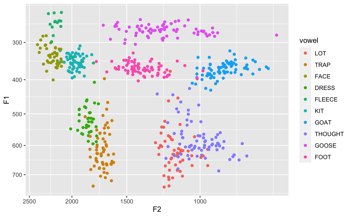
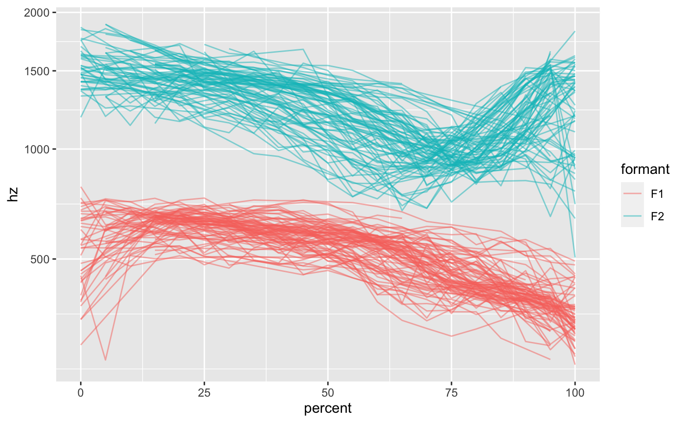
library(ggplot2) # You can use this function wherever you'd use `scale_x_reverse` or # `scale_y_reverse`. Here is a simple F1-F2 plot: data(vowels) ggplot(vowels, aes(F2, F1, color = vowel)) + geom_point() + scale_x_bark() + scale_y_bark()# If you want to plot a spectrogram-like plot, you only need `scale_y_bark`. # Be sure to set `rev=TRUE` so that the axis is not reversed. data(mouth) ggplot(mouth, aes(percent, hz, color = formant, group = traj_id)) + geom_path(alpha = 0.5) + scale_y_bark(rev = FALSE)